
NHANES, and why only two cycles.
The National Health and Nutrition Examination Survey (NHANES) samples the US population every two years, pairing a home interview with a physical exam and a full laboratory blood panel. It is one of the few public datasets that links biomarkers to the same person's exam results.
This catalogue only uses the 2013-2014 and 2017-2018 cycles. Earlier cycles did not collect every biomarker this model needs, since markers such as albumin and alkaline phosphatase were only added to the panel later. The 2019-2020 cycle was interrupted mid-collection by COVID-19, so its sample is not treated as a reliable population baseline.
Restricting to adults 18 to 45 across two consistent cycles trades sample size for consistency. The numbers below are what survives that trade-off.
years of root mean squared error, with only 2,200 people left
years of error, with 5,170 people recovered
years of error, despite the more intuitive approach
Missing is a pattern.
The original file had 113,249 rows. It also had 69 percent missing glucose and 91 percent missing insulin. A clean looking subset could quietly turn into a different population.
Dropping incomplete rows does not only reduce the data. It changes who gets represented.
Choose a cleaning method
Select a tab to see its stats and tradeoffs; the diagram, code, and output update with it. The raw tab shows the missingness as-is.
No cleaning method applied yet. The diagram shows the raw overlap between the three biomarkers with the most missingness.
A row survives only if every one of the three flagged biomarkers was measured. Strict, and the easiest method to explain or audit.
Pros
- No assumptions about the missing values
- Simple to reproduce and defend
Cons
- Cuts the usable sample by more than half
- Can quietly change who is represented
Each biomarker with gaps is modeled as a function of the other biomarkers, and missing values are predicted iteratively rather than filled with a flat mean.
Pros
- Keeps almost the full sample
- Captures relationships between markers
Cons
- Imputed values are estimates, not measurements
- Must be fit inside the training pipeline to avoid leakage
Insulin alone accounts for most of the missingness. Dropping the column, then dropping only rows missing protein or glucose, keeps far more people.
Pros
- Recovers most of the missing rows
- No imputation assumptions needed
Cons
- Loses a biomarker with real biological signal
- Only works because one column drove most of the loss
Predicting age with age.
The model's inputs were biomarkers that already drift with age. Its target was chronological age. Training it to shrink the gap between prediction and calendar age can just teach it to reconstruct the calendar, which is circular reasoning, also known as petitio principii: assuming the very answer you set out to find.
If the gap between predicted and actual age is the biological signal we want, minimizing that gap destroys the thing we are looking for.
Switch the tab below to see how changing the training target changes what the model is allowed to discover.
Blood panel values feed an XGBoost regressor rewarded whenever its output matches chronological age.
Pros
- Simple to train and validate
- Good for catching data quality bugs
Cons
- Rewards mimicking age, not detecting biology
- Flattens the acceleration signal we actually want
Each biomarker gets its own age trend line. A person's deviation from that trend, weighted by how reliable the marker is, becomes their KDM biological age.
Pros
- Breaks the circular target
- Stable enough to compare across people
Cons
- Still shaped like age, not mortality risk
- Needs a large reference population to fit trends
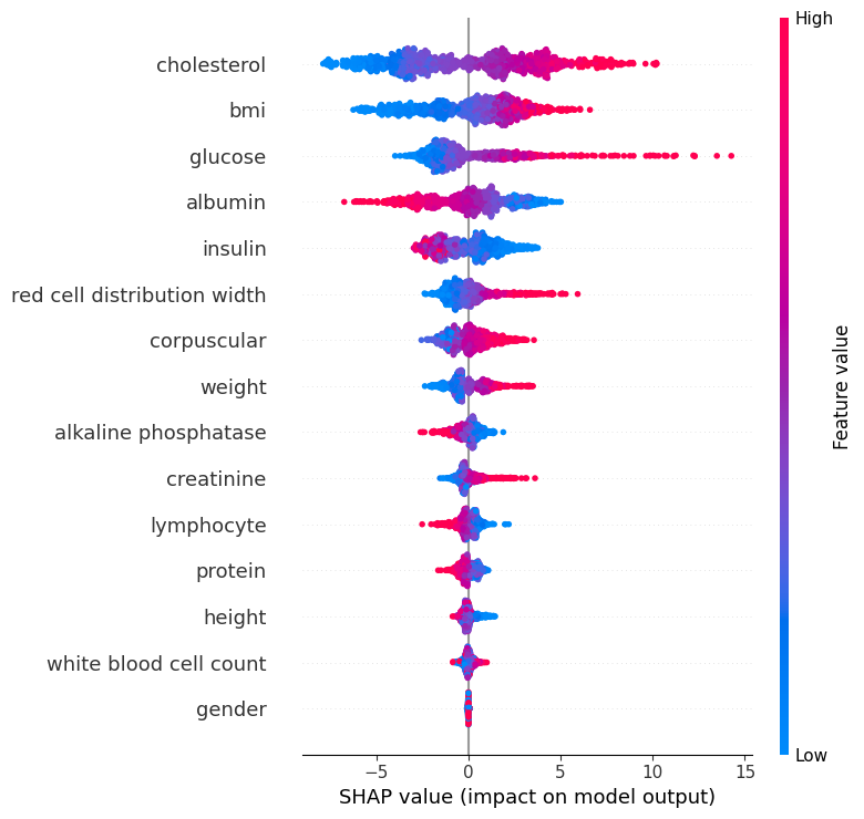
Open the black box.
The KDM target lowered the error, but a lower number is not enough on its own. A useful model also needs stable residuals and biomarker effects a clinician would recognize.
Use the tabs to inspect the evidence from three angles. Each tab explains the term below.
Biological age calculator: test a blood panel
The complete trained forest lives in this page. Change a value and your panel walks through 2,000 decision trees in the browser. No blood data is uploaded.
Start with a profile or adjust the six common values. The remaining markers stay at the population mean unless you open them.
Adjust eight more biomarkers
Where each value sits
Green bands mark the model's neutral range for each biomarker. The dot is your current input, and it turns red once a value sits outside that band. Extreme outliers are excluded from each axis so the scale stays readable.